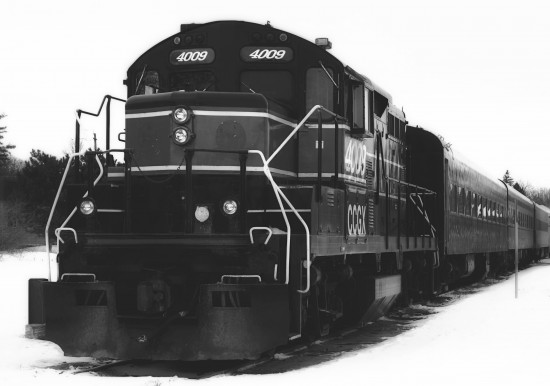
19 Feb elusive {50/365}
This is the third time I’ve been down to the railway station, trying to get a shot of this engine. Mother Nature is not cooperating with me and I have yet to figure out what I’m doing wrong with the exposure.
But you know what? I like it better in black and white anyways. Stick it, Mother Nature :)
I was messing around earlier (when am I NOT messing around?) making some digital elements for scrapbooking and I made this for my 365Project …


which I thought looked pretty cool. But when I put it on the photo,
I don’t think it looks right. It’s distracting, isn’t it? I see other people do stuff like that and I think it looks great. Hence the wasted hour spent making mine … LOL!
I dunno. What do you think?
EDIT: forgot to post the original shot! LOL!!!

So yeah, I cropped it to get rid of the building and make the engine more of the focal point, and added a bit of a glow to the black and white version. But see what I mean about the exposure? I’m getting the train nice and black (she’s a beauty) but the dismal sky and crappy snow are wonky.
Try, try again! I think I’ll have more luck in summer.
—————————————————————
You can find my 365 project on flickr or check out the flickr group for Shutter Sisters.
For all daily photos posted here – Click project365 in the Category list in the right sidebar.


Sue W.
Posted at 21:50h, 19 FebruaryI like the mark but perhaps it should be on the other corner so it isn’t breaking up the pristing white of the snow. That draws too much attention to it. Try in the lower left corner, maybe.
janice
Posted at 22:13h, 19 FebruaryHi Sue!!! :)
I was also thinking that maybe I should’ve drawn a thin lined inner frame and have the circle as one of the corners … know what I mean? I tried it, but wasn’t sure of that look either. bah!
Tug
Posted at 21:50h, 19 FebruaryI think B&W does this photo well…maybe if you tone down the watermark a little? Transperatize (heh) it just a tad?
.-= Tug´s last blog ..Sunflowers, without the sun =-.
janice
Posted at 22:14h, 19 FebruaryI did, but just a bit. Should probably have went lighter.
I need to find a few examples of what I’m trying to do, I think.
janice
Posted at 22:04h, 19 FebruaryAll this uploading and I forgot to put up the original.
Going to grab it …
Tug
Posted at 22:17h, 19 FebruaryDefinitely like the crop & B&W on this one! I’ve seen what you’re talking about…don’t think yours takes away any more than theirs do – maybe just a little more transparent, or use a light gray?
.-= Tug´s last blog ..Sunflowers, without the sun =-.
Sue W.
Posted at 22:27h, 19 FebruaryI like Tug’s idea about making the mark a little more transparent, like a true watermark. Try it in the left corner too so it isn’t competing for attention and breaking into the nice white snow. I LOVE the train and I have to say I really love it in color!!! It’s bold and it really is gorgeous.
janice
Posted at 22:58h, 19 FebruaryIsn’t it? That’s why I’ve been trying so hard to get it right. I think summertime will be good. I hope!
I’m going to try moving the stamp around. I didn’t want it to look like a watermark, but maybe it would look better that way.
Thanks!!
Nicci
Posted at 04:56h, 20 FebruaryLooks slightly washed out to me, but I am no professional.
I usually go http://forums.photographyreview.com/index.php there and ask for advice. They are nice :)
ooh I love the watermark idea. Why don’t I think of things like that.
maybe next year when I actually buy my own site for this project. hmm…might do that later on this year.
.-= Nicci´s last blog ..skool dayz =-.
janice
Posted at 10:06h, 20 FebruaryI’ve overexposed the snow and sky, trying to get the richness of the train. I think I need a faster shutter speed. Or a sunny day! LOL …
It’s not supposed to be a watermark. More like a digital scrapbooking element, y’know?
Lexi
Posted at 07:31h, 20 FebruaryA watermark would be less distracting on this particular pic, but the “logo” (for lack of a better word in my brain this early on a Saturday) looks like a stamp, so I get what you’re getting at. Maybe if it was another color, blue or something?
.-= Lexi´s last blog ..Cabin Fever =-.
Lexi
Posted at 07:33h, 20 FebruaryP.S. When I have an exposure issue, I always try “equalize” in photoshop. Sometimes it jacks it up, but sometimes it surprises me and is perfect, esp. with snow pics.
.-= Lexi´s last blog ..Cabin Fever =-.
janice
Posted at 10:07h, 20 FebruaryEverything I try messes up the train.
I want to be able to get this shot right and not have to fix it! Well, not much anyways :)
Chatty
Posted at 08:57h, 20 FebruaryI love it in both color and black and white. I have been trying forever to think of a stamp/logo for my pictures. MIne is so boring. I guess I can’t be TOTALLY creative! ha ha ha
.-= Chatty´s last blog ..Woot =-.
janice
Posted at 10:15h, 20 FebruaryYou want a watermark, right?