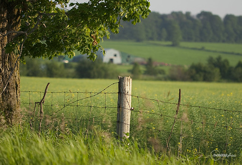
09 Jul friday’s fence {190/365}
The farmhouse edition ;)
I wish I would’ve framed this a little better – the fence post more to the right instead of so omg pretty much dead centered. I didn’t even notice it when I was shooting away. I was totally enthralled with the farm house and the evening light and getting the depth of field right.
I do that often, actually. Concentrate on one thing, and totally forget about all the rest. But it’s happening less and less these days.
It’s a learning curve. heh.
Anyways, short and sweet tonight. I’m totally beat.
Happy Fence Friday!
—————————————————————
This shot taken for flickr groups Fence Friday and Fench Friday.
You can find my 365 project on flickr or check out the flickr group for Shutter Sisters.
For all daily photos posted here – Click project365 in the Category list in the right sidebar.


Nicci
Posted at 06:10h, 10 JulyI really need to join some of these groups so I have something to shoot when I am out of inspiration:)
Other than the dead centeredness of the picture, I really like it. It is peaceful.
janice
Posted at 08:40h, 10 JulyThey do help, and the feedback from other members is really great to have.
Sue
Posted at 08:39h, 10 JulyI, personally, LOVE the fence post dead center. I think it really is the star of the show because the barn and field beyond are blurred… Here, it stands out and stands alone, a sole sentinal guarding the land, old and gray, but faithfully doing his duty.
janice
Posted at 08:43h, 10 Julyaww! Thanks Sue!
I was concentrating on the tree to the left and getting the barn in between the tree and the fence just right … didn’t even realize where the fence post was ending up!
Multi-tasking … *sigh*
LOL! ;)
MonybeaN
Posted at 11:13h, 10 JulyAwww J, the farmhouse, rolling hill and lush green trees are the perfect backdrop… I’m still learning all the technical things, however these armature eyes think your photo is divine :) My thoughts, its okay to find center.
Chatty
Posted at 14:21h, 10 JulyI love the clarity of the post with the farmhouse blurred out. It’s perfect.
Tug
Posted at 14:41h, 10 JulyI think the brightness of the tree helps take away from the mid center of the post. I love this one; totally calming photo that just takes you in and makes you stop and breathe…
janice
Posted at 14:52h, 10 JulyIt was like that IRL :) AND there were these little tiny white butterflies dancing around everywhere over those fields but I couldn’t catch the little guys!
I tell ya, the rural areas around my home are just gorgeous.
Tug
Posted at 15:05h, 10 JulyWe’ve got a lot of that around here as well, but I am SO petrified of snakes I don’t go out – I can just see me fainting from fear & being left out there bitten. I really need to get help – lol.
Hyacynth
Posted at 22:06h, 10 JulySee, I like it like that. But, you know, I often find that framing is one of my challenges. I always want more when sometimes less is better.
Jamie S
Posted at 20:06h, 12 JulyI like the way the alignment of the fence post draws your eye towards the farm house